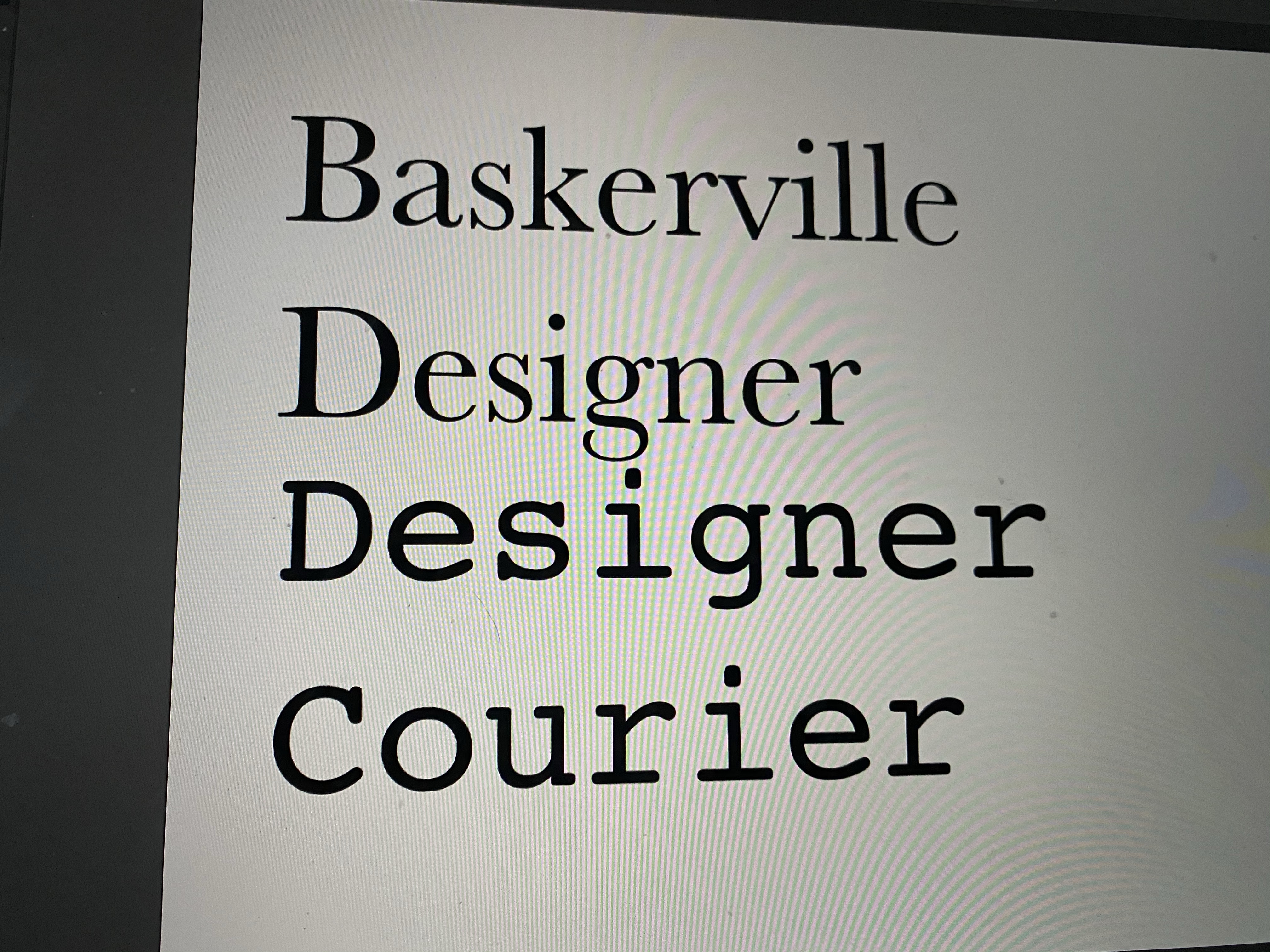
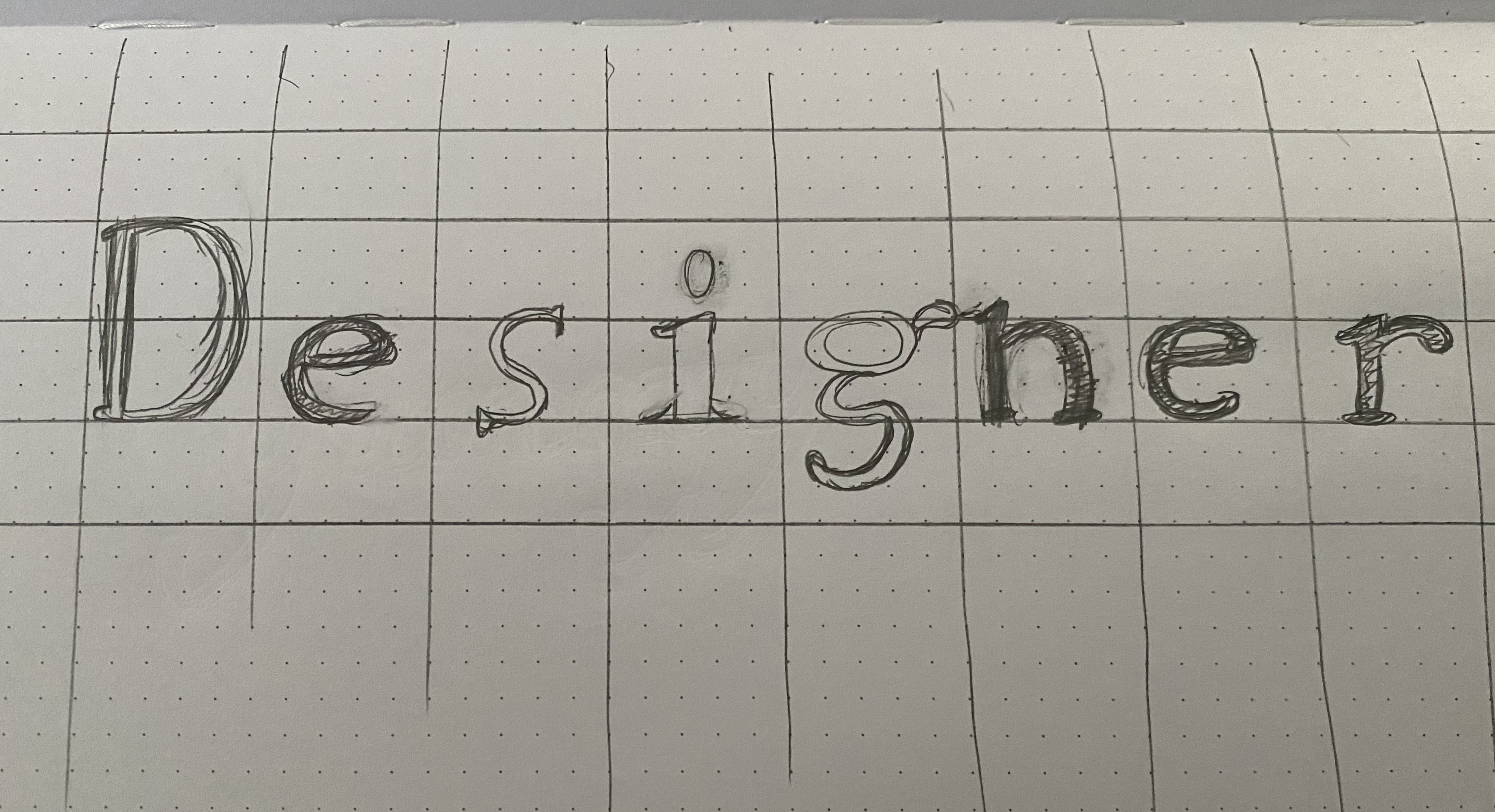
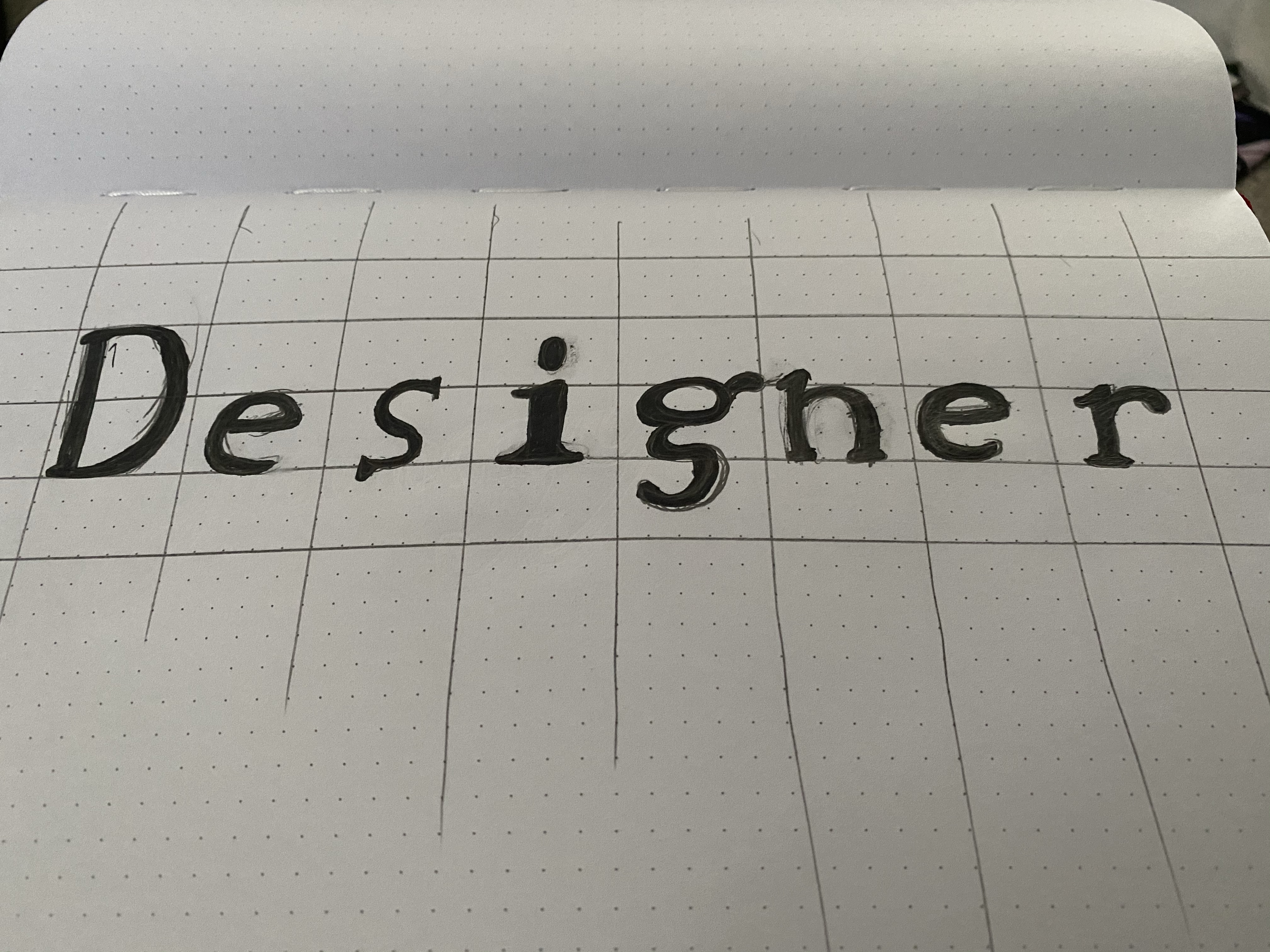
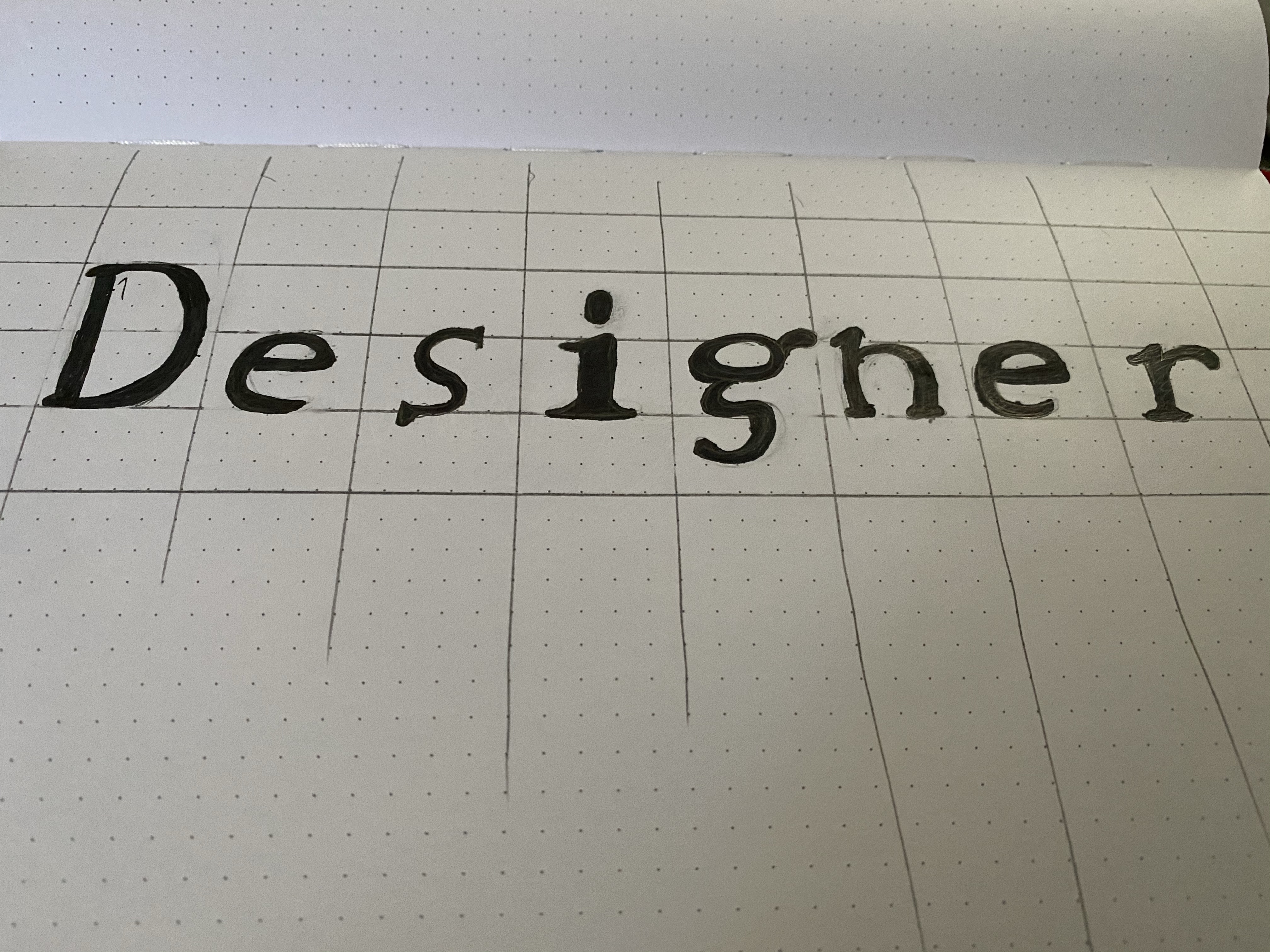
I merged Baskerville and Courier. Baskerville uses curves to lean into its serifs while Courier is consistent line weight and straight lines but rounded serifs. Baskerville also has a strong line weight variance and small spacing between the letters, while Couriers is a set distance.