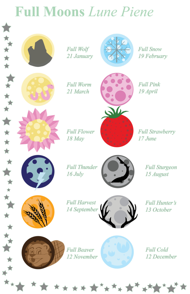
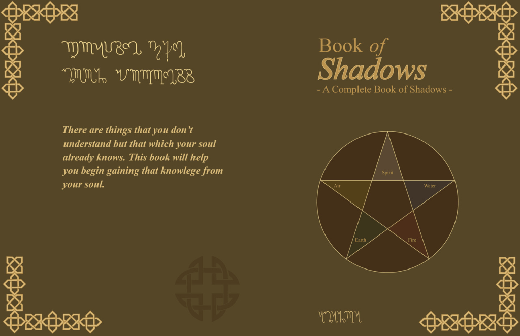
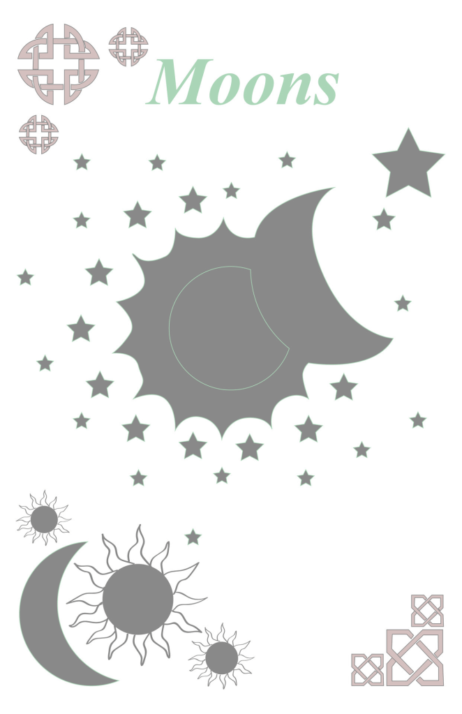
While looking through my old social media posts, I found some old designs from a B.O.S. I made back in college. I’m surprised these pages look as good as they do, albeit I see some alignment issues. I remember thinking about this shortly after creating it and not being happy with how it turned out, as I had originally been going for an illuminated bible style. I had added more simplistic (cartoon) designs than I originally wanted as those align more with my style, but not the illuminated biblical manuscript style I wanted. There are three font types used, two of which are a standardized type that anyone can get and one that I made myself. The one I made is not in English and is only seen on the middle image. I spent roughly 5 hours on that one font alone, researching old witch and wican scripts, then using the letterforms I found to create an alphabet that translates into English, then in Illustrator creating the alphabet to be used on the covers. I cannot tell you how long I spent on each page of the BOS, nor can I remember how long it took me to design the cover, after all of the time it took another hour or two for me to put the pages into the correct layout and print them, then more time to hand cut and bind them. Perhaps all the time is what makes me look back fondly on these, even with the issues I can see now.
