

I sketched out some ideas for my poster based on my handmade type phrase I recently posted. I also sketched some ideas for a peer.


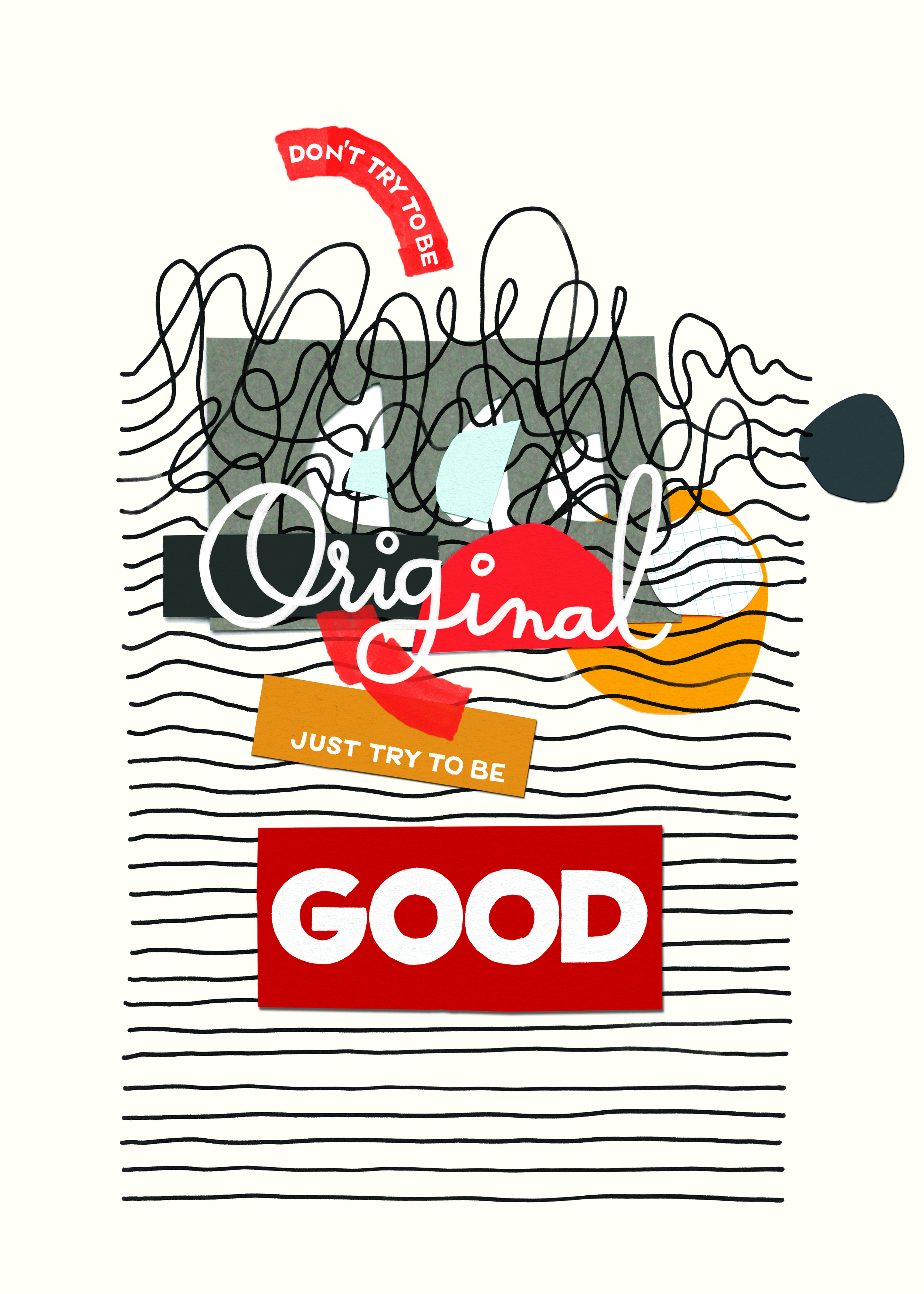

The first poster is the kind of type I wanted to make. The second is the same cut-out feel mine has. The third has the text freely overlapping each other and the rounded letterforms are angled similarly to mine.
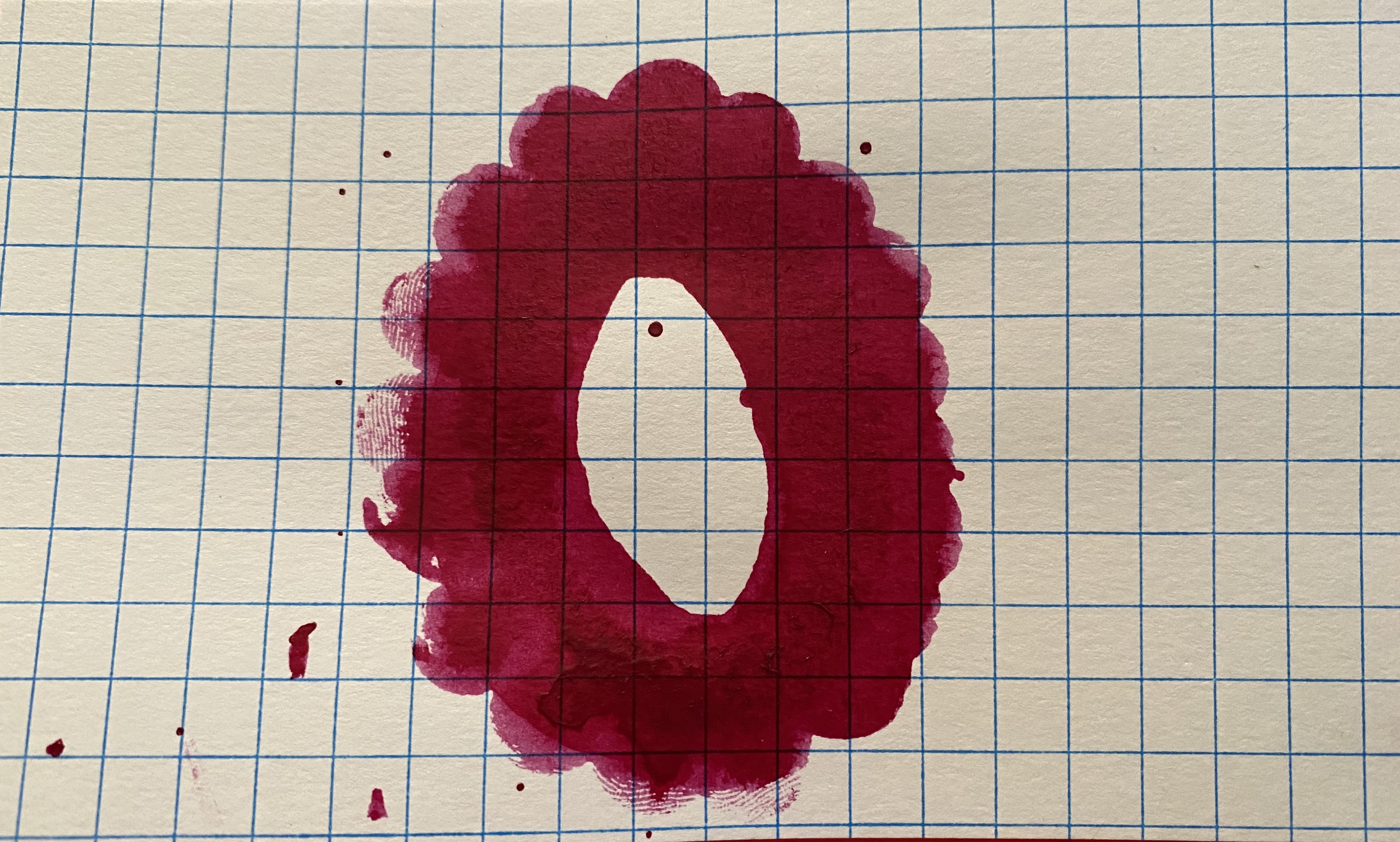
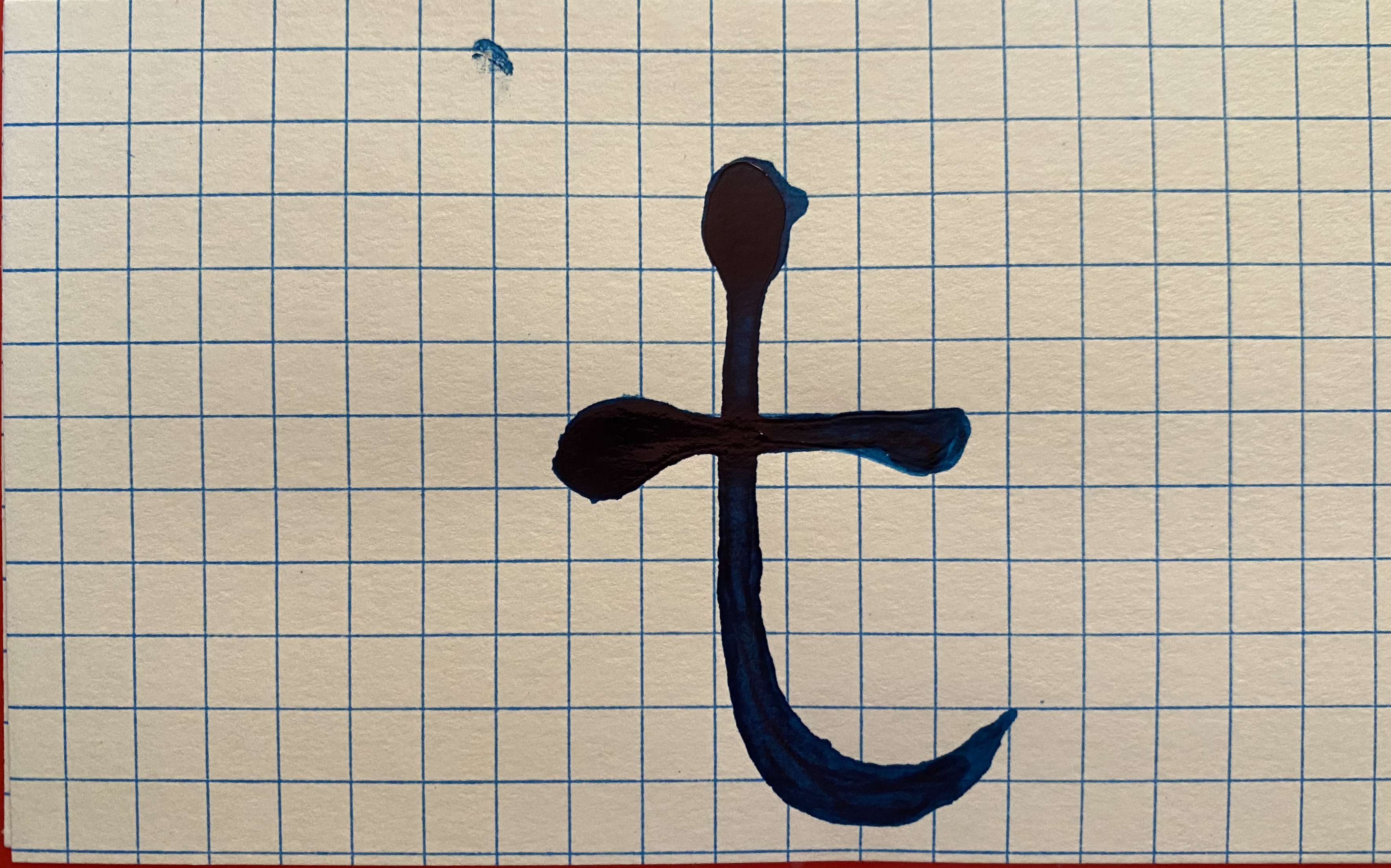
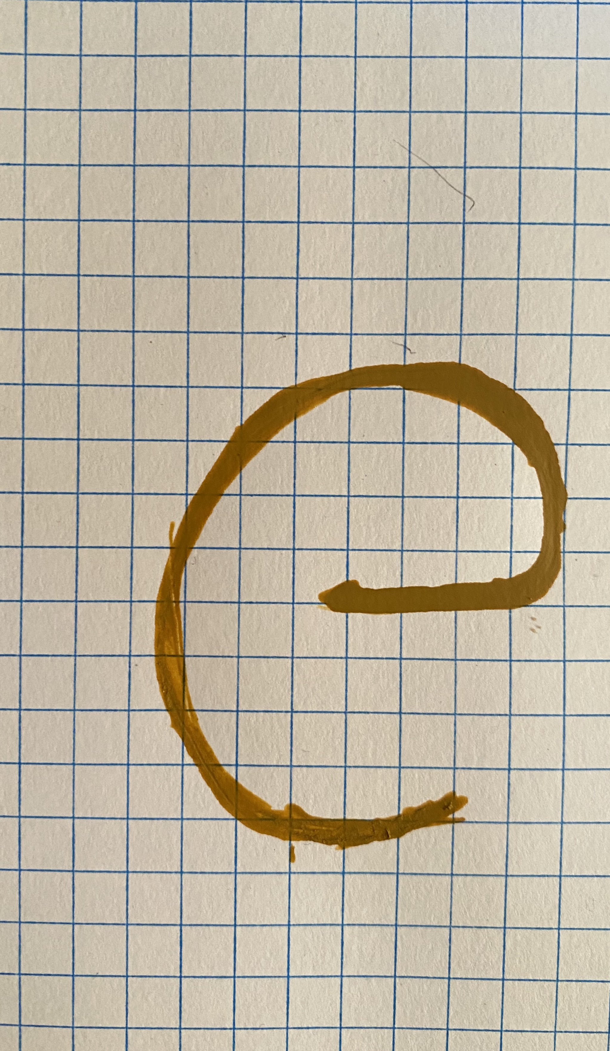


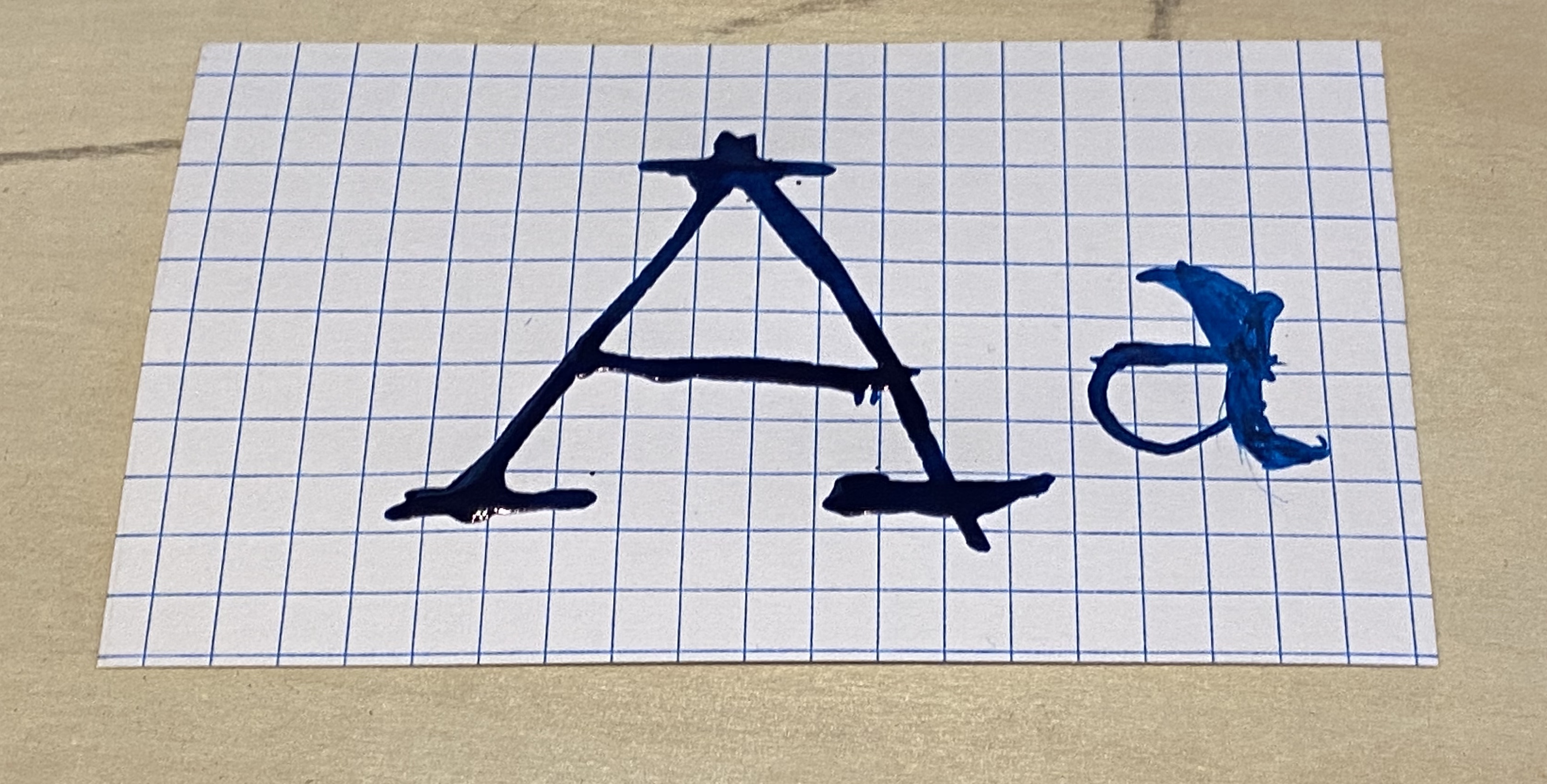
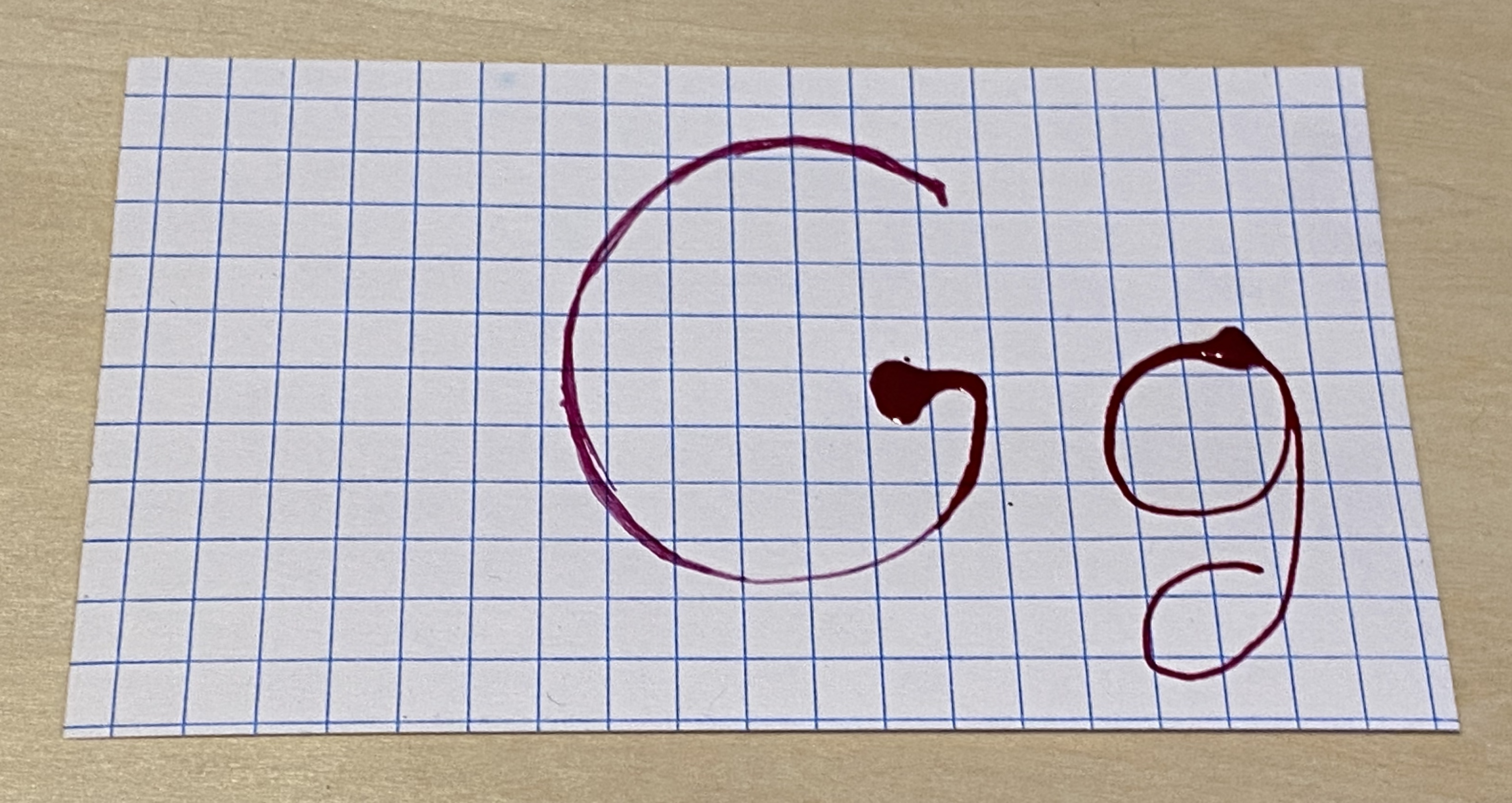

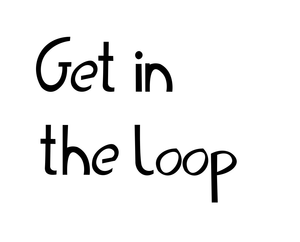
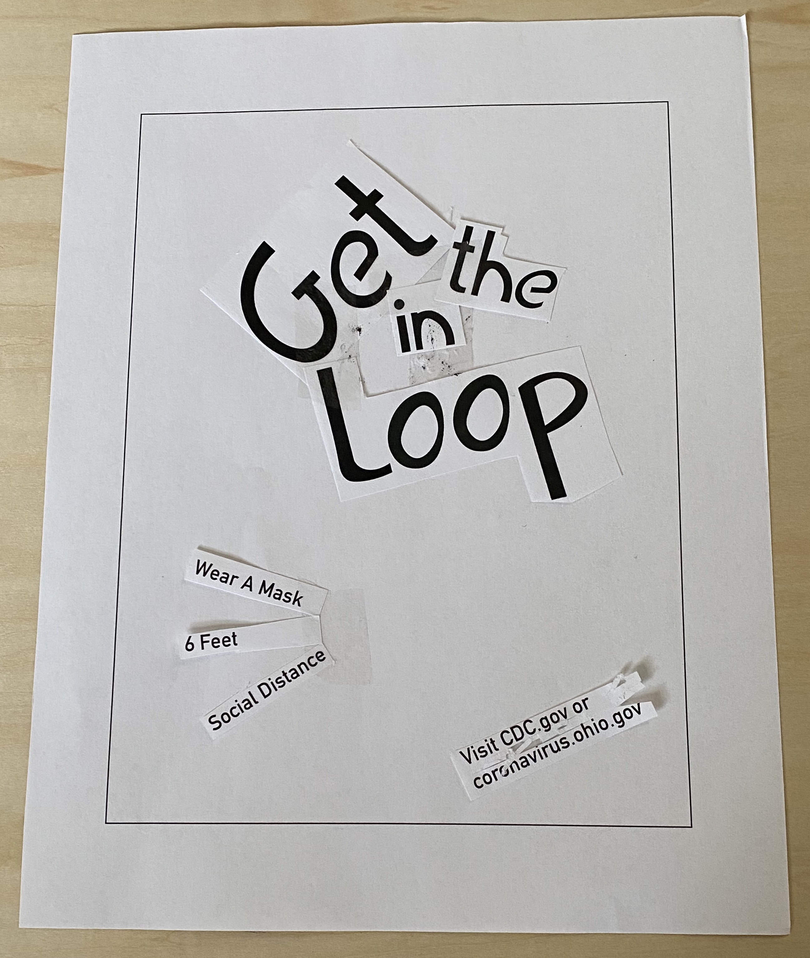
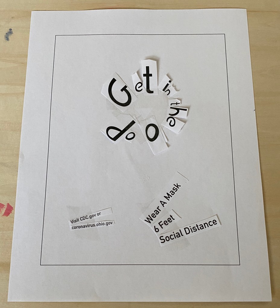
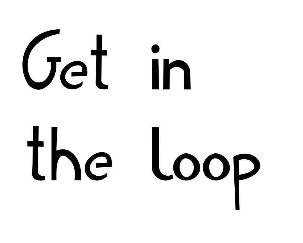
I started with the idea of using the idiom in the loop to question if people have actually looked up what they know about the pandemic and the protective measures they use. Then realized it felt too gentle for such a serious issue and the question would be answered yes even if they didn’t go to the right kind of sites(right = trustworthy). I decided to have a demanding phrase to tell people to research their ideas around the pandemic. I used tracing paper over my original sketch to get a couple versions of the lettering; however, my glass pen I was trying to use to keep my lettering steady broke on me twice. After it broke I used a brush pen but didn’t like the way the lines worked so I used a fine liner and a sharpie to get the final version. I was using tracing paper from the first lettering set on so I edited the photo to be easier for me to import it into illustrator and edit to my liking. I changed a good chunk of the lettering inside of illustrator as the variance in weight didn’t function the way I originally intended. Above is the final and below is the process.


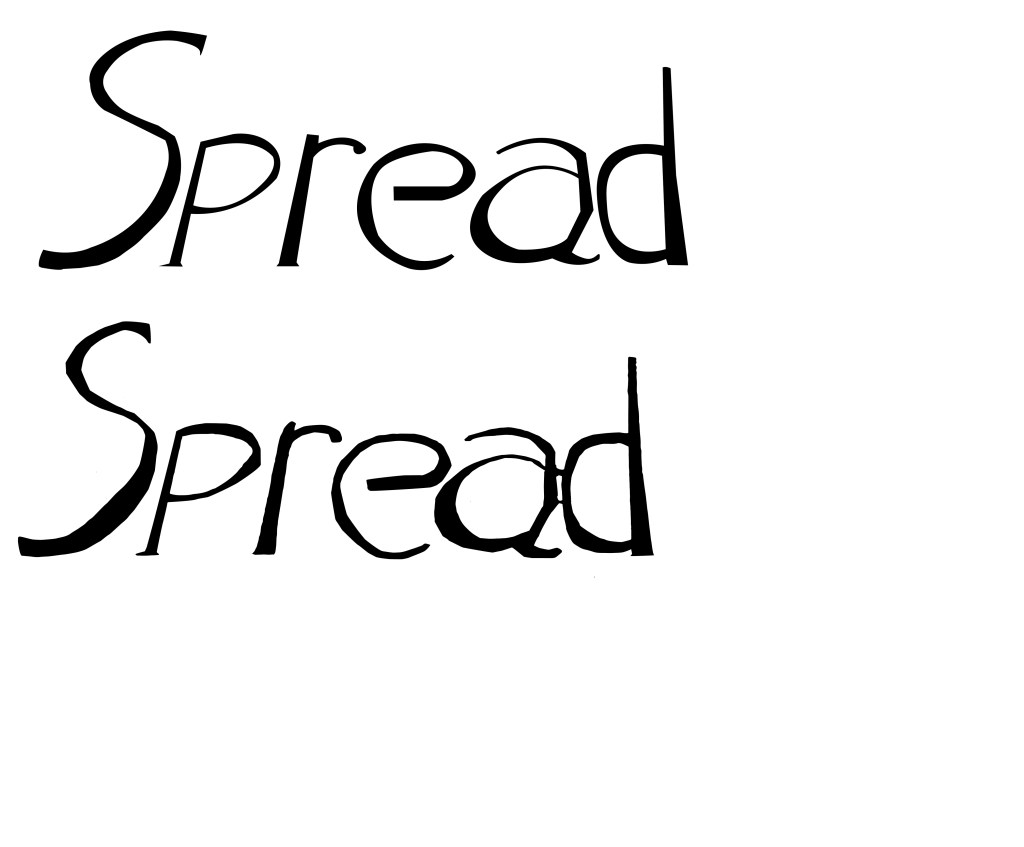
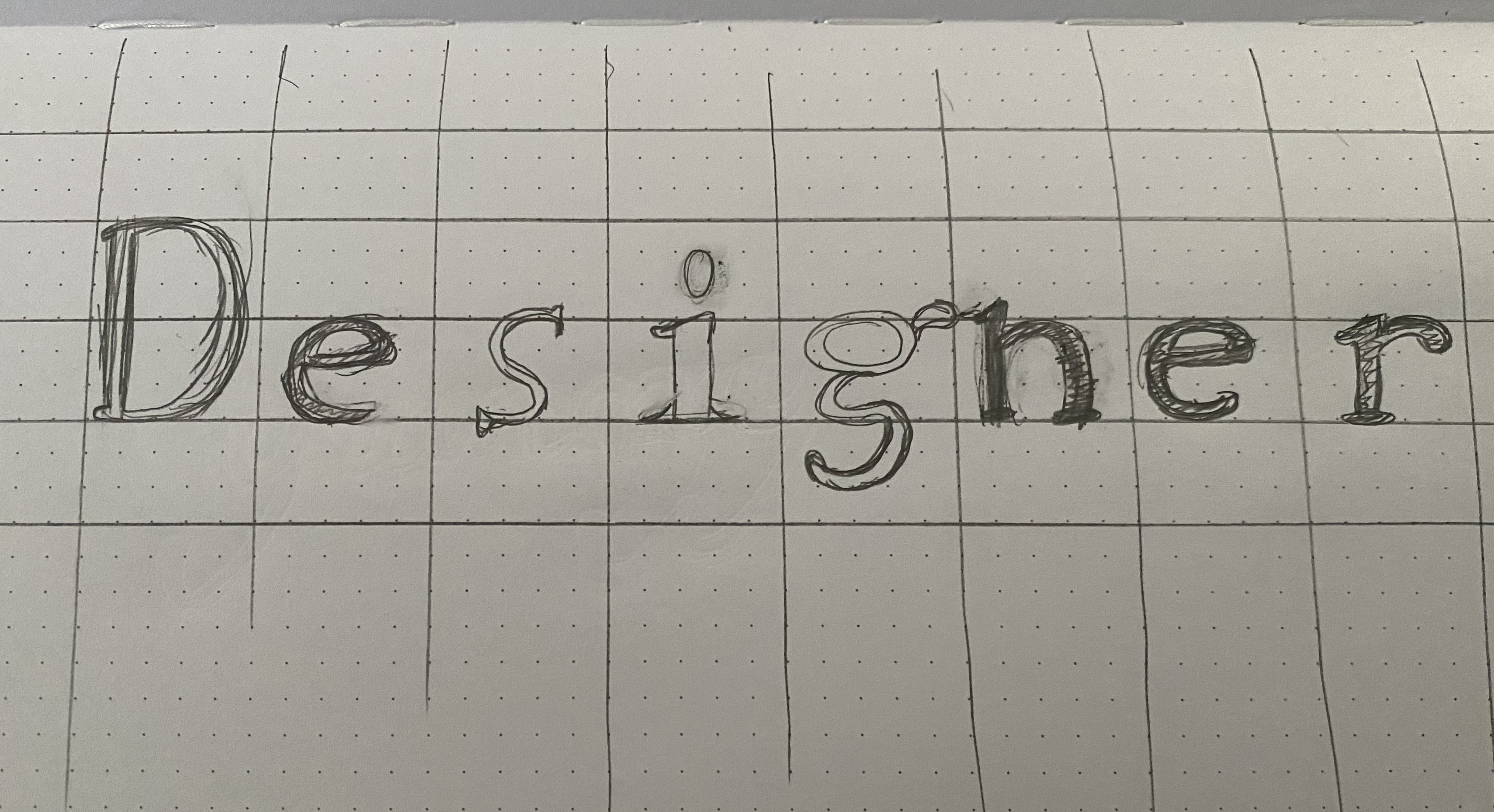
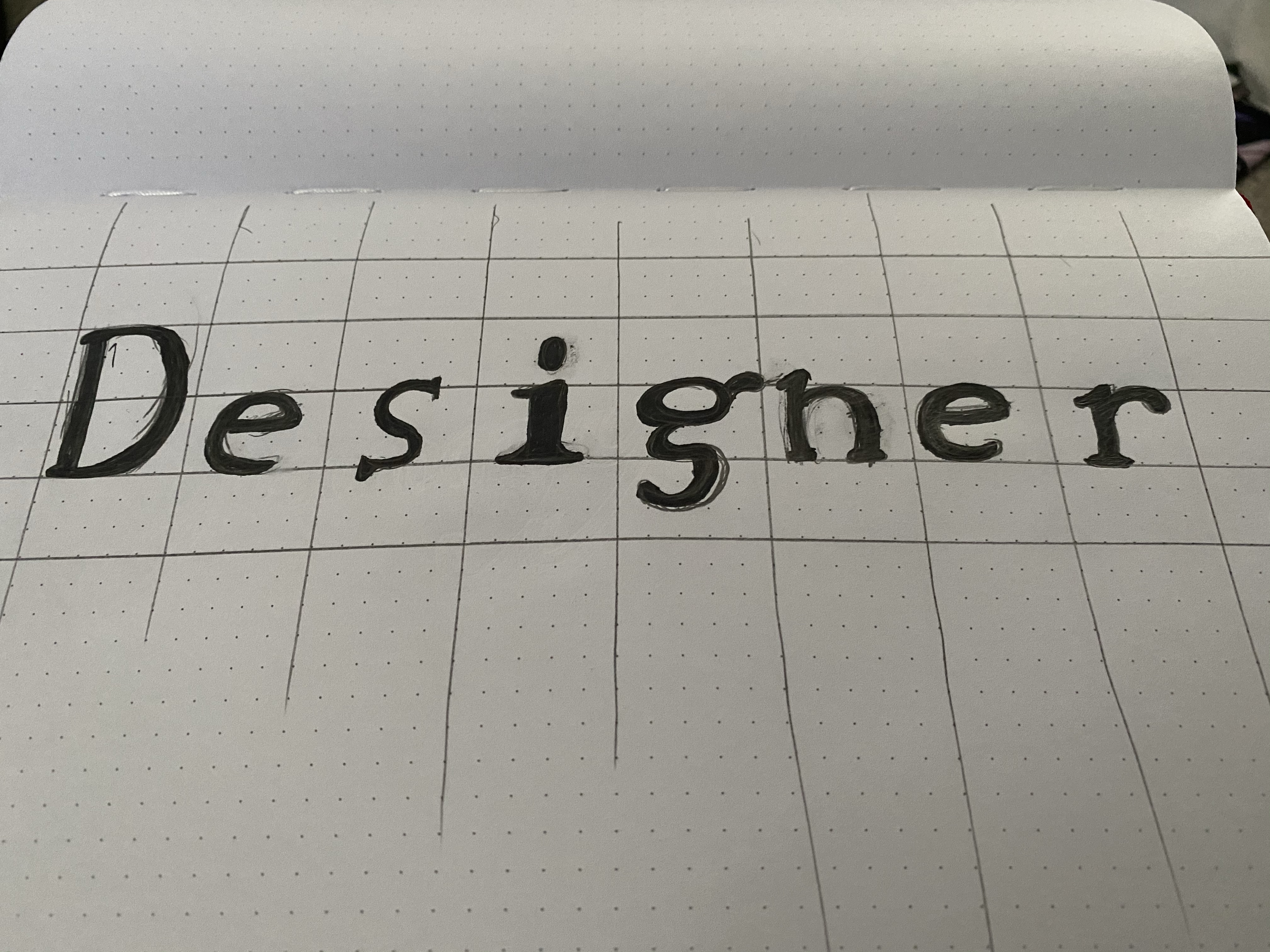
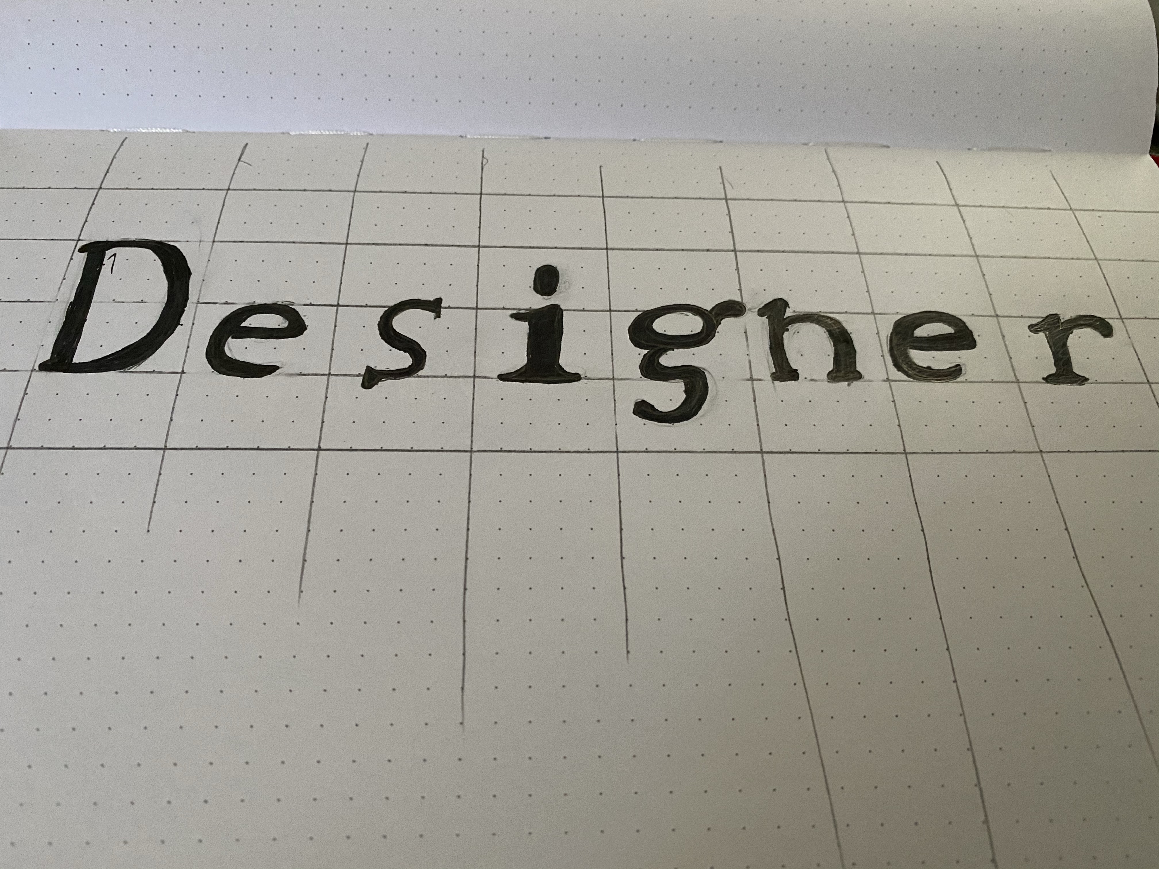
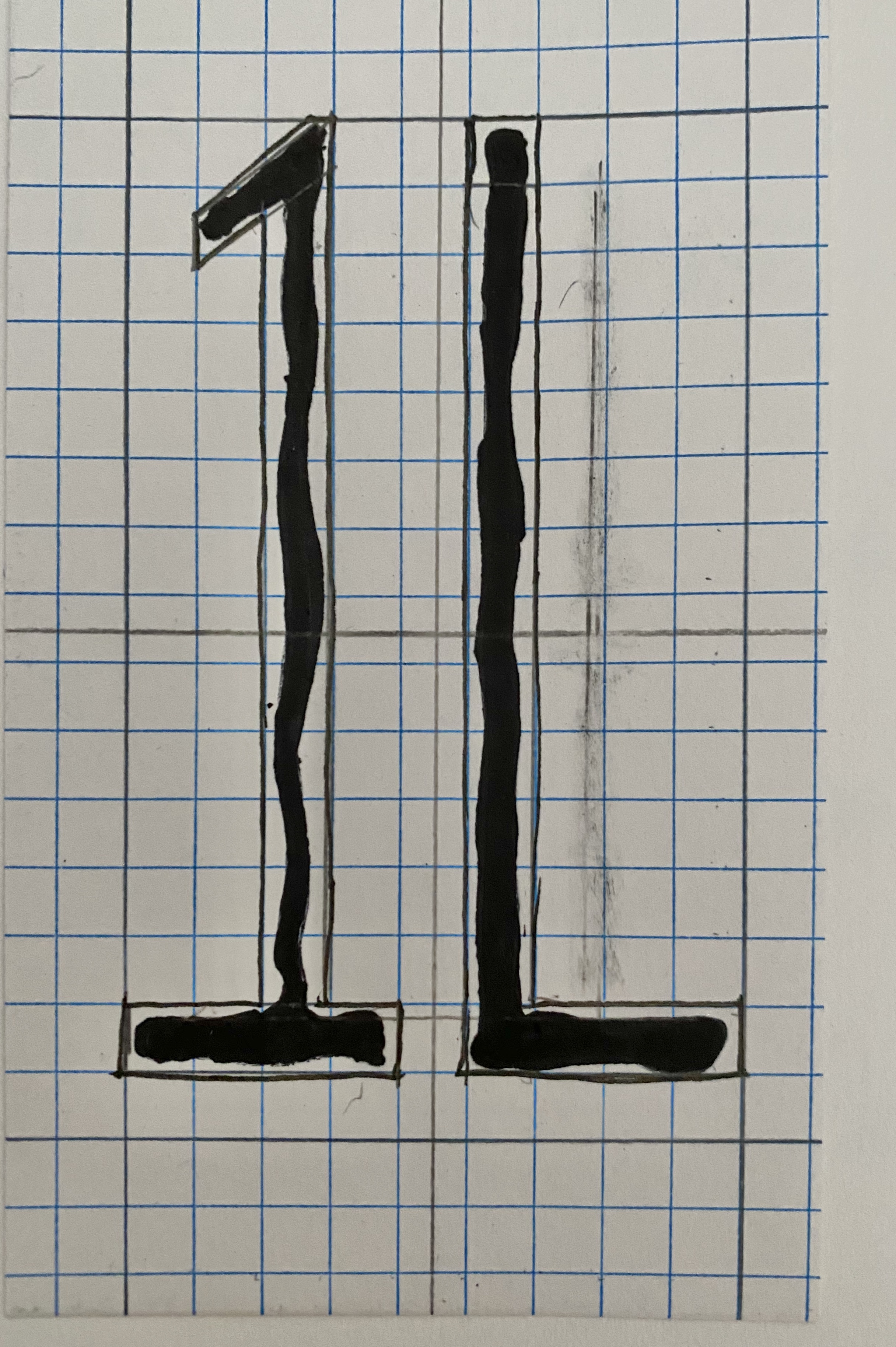
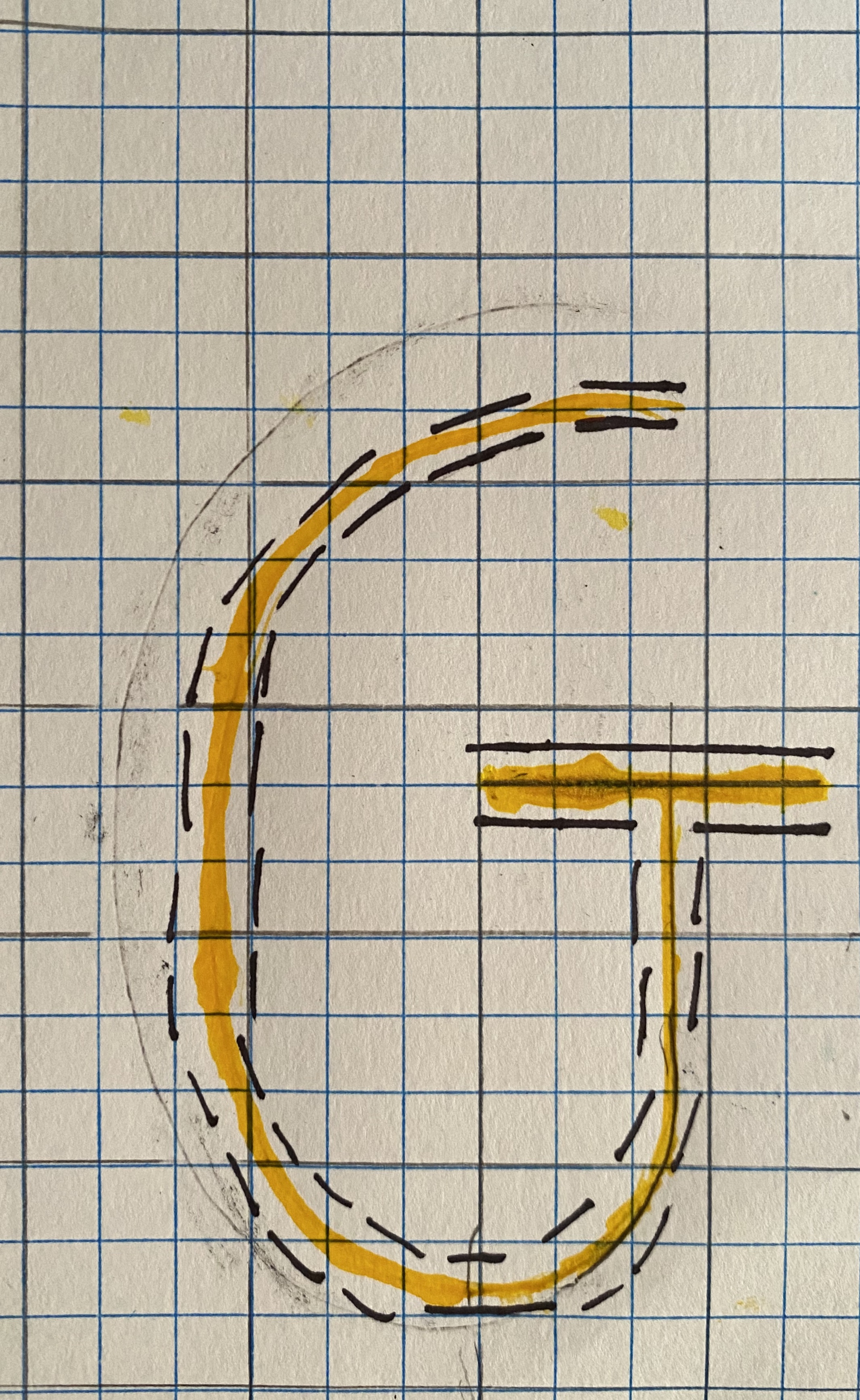
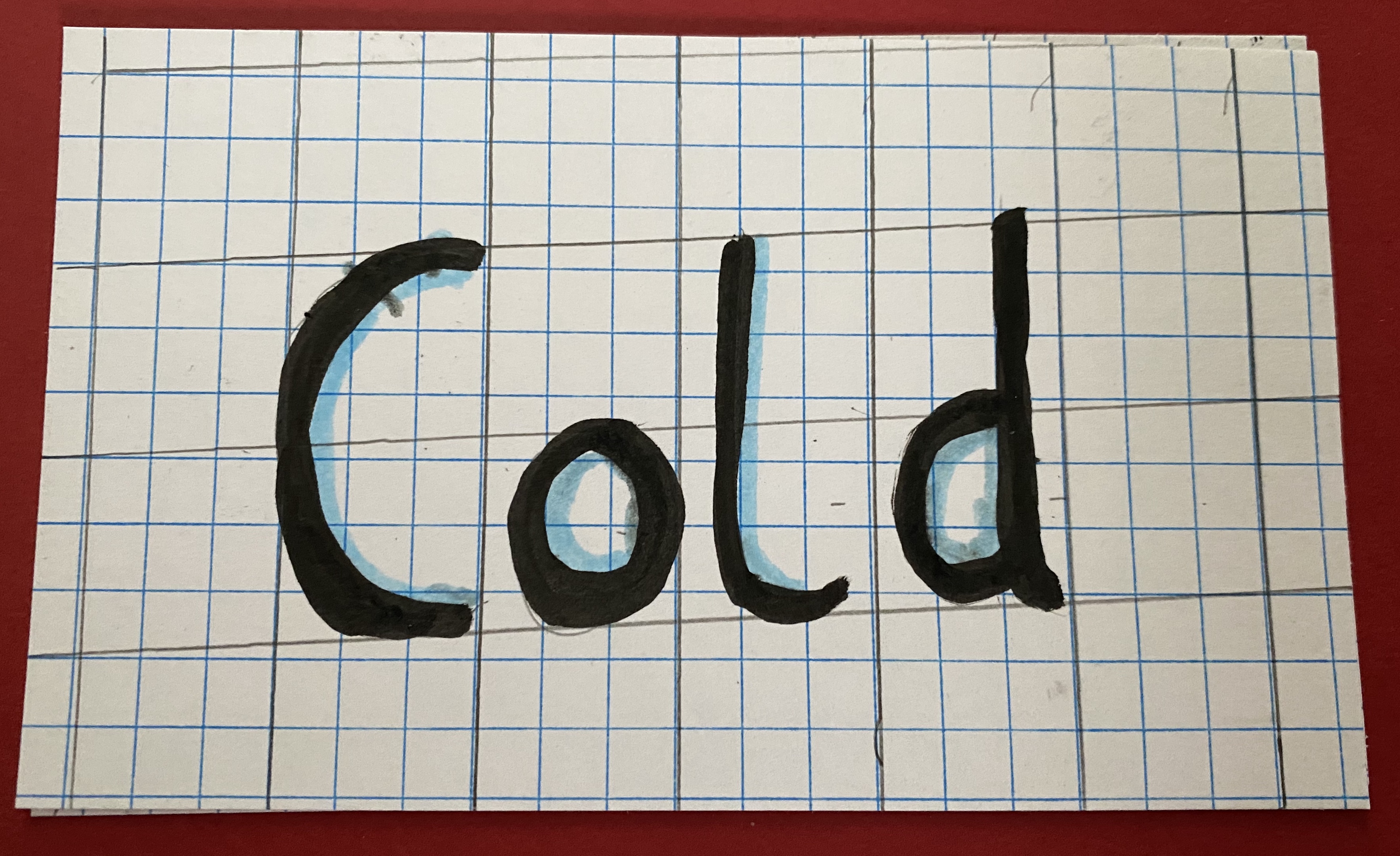
The first image shows what I hand lettered and the other image shows two different ways I turned it into a vector. The top of the secound image is made with the pen tool in Illustrator while the bottom is made with image trace then corrected given it adds a lot of anchor points.
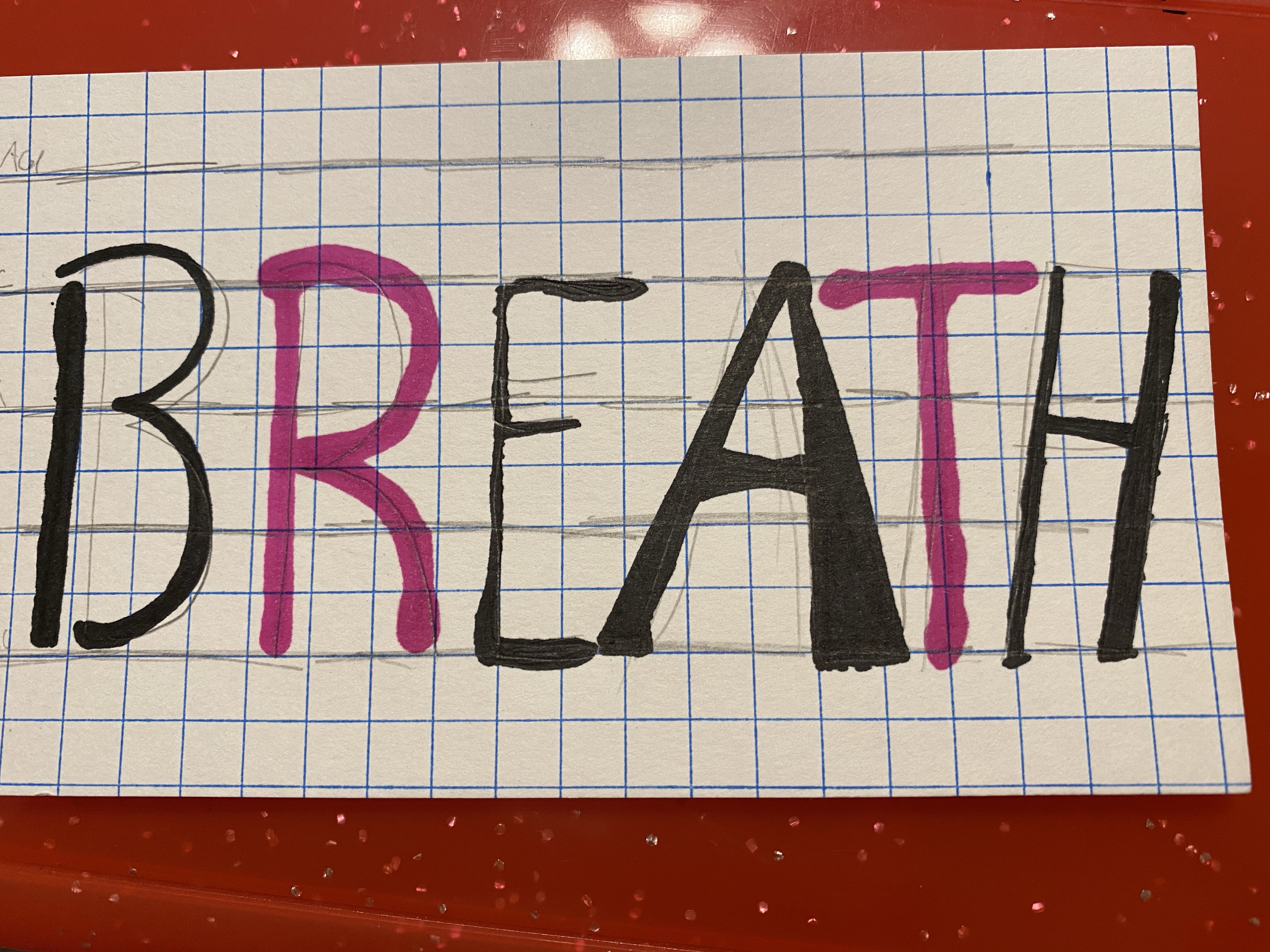
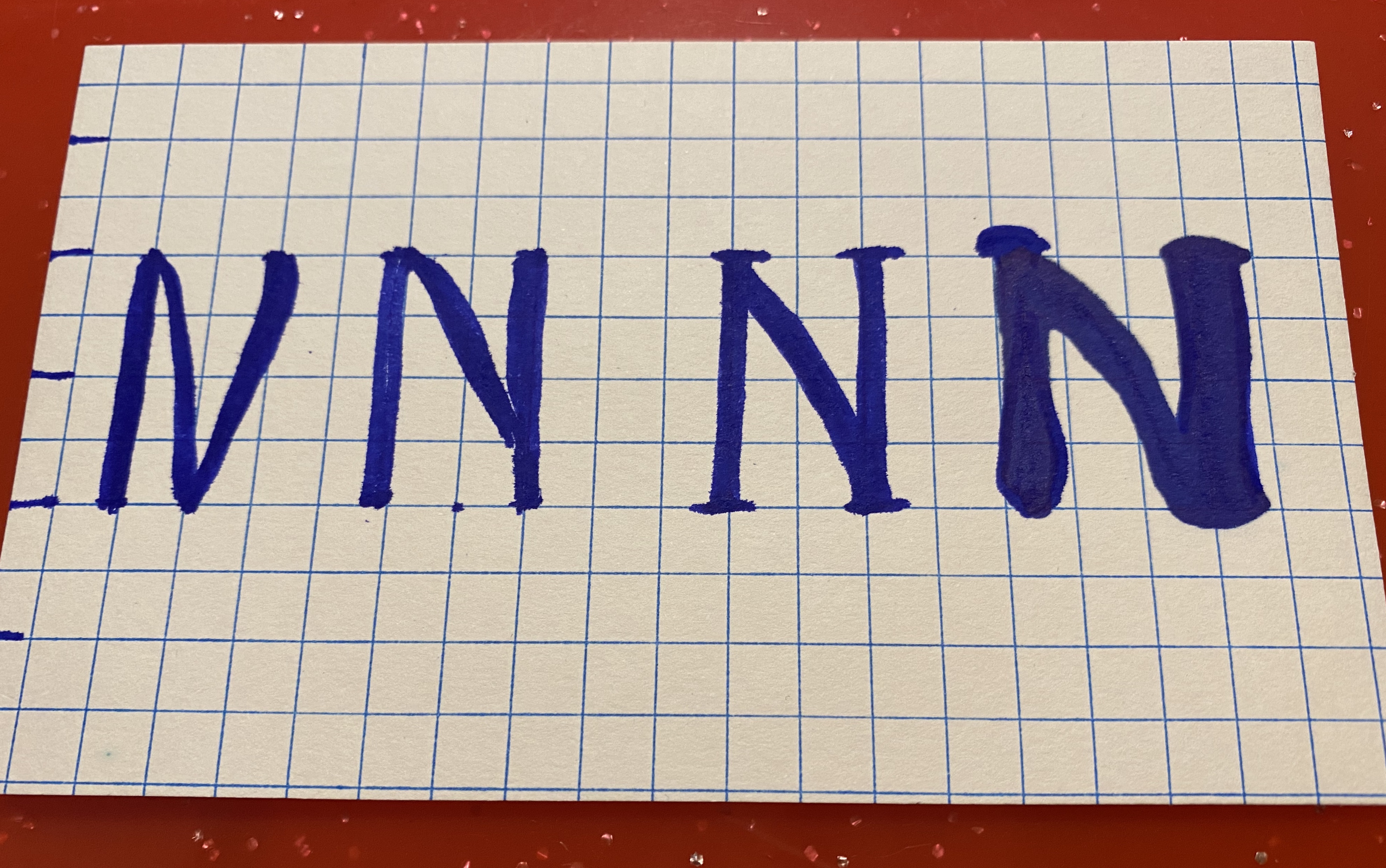
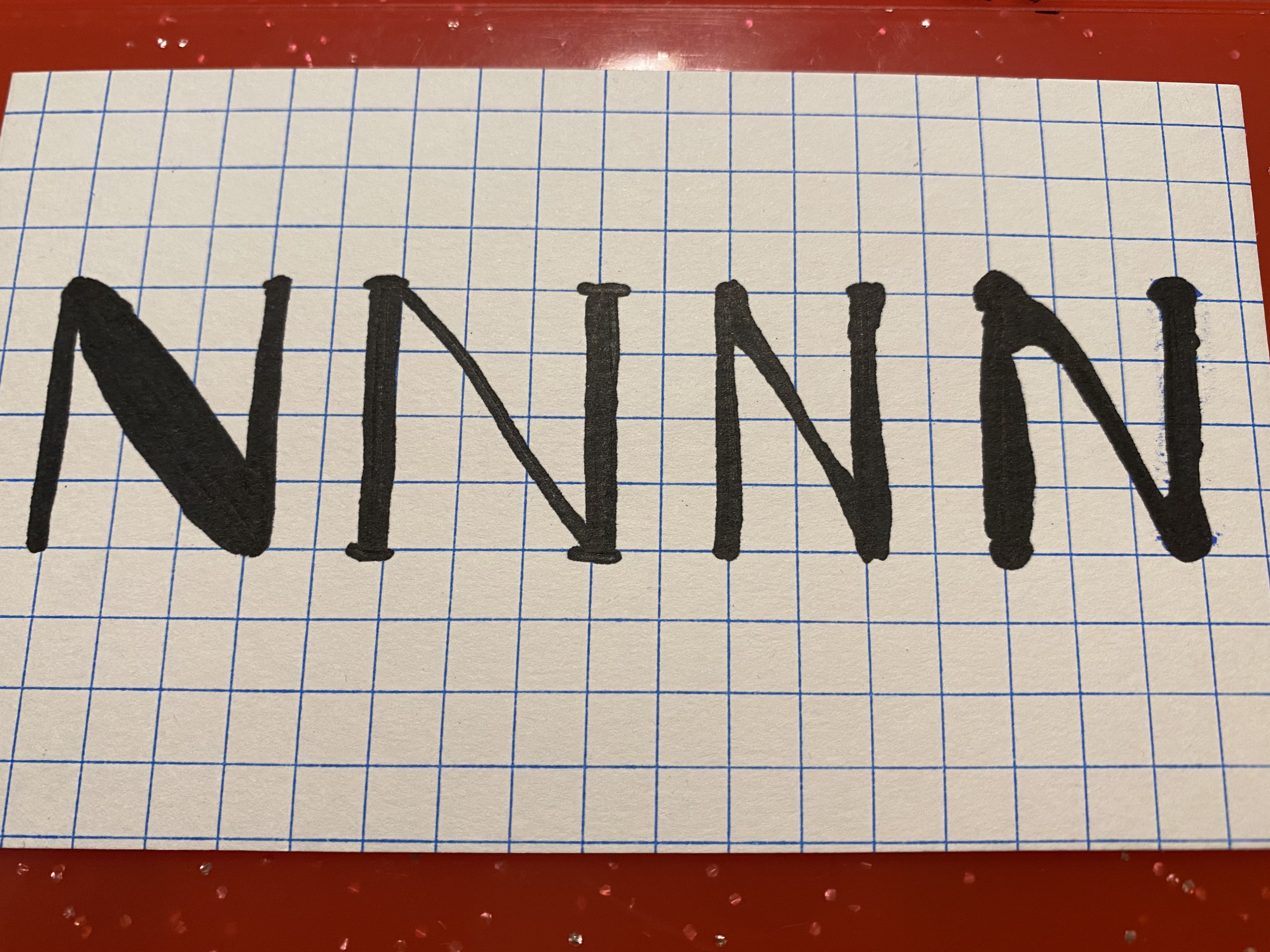
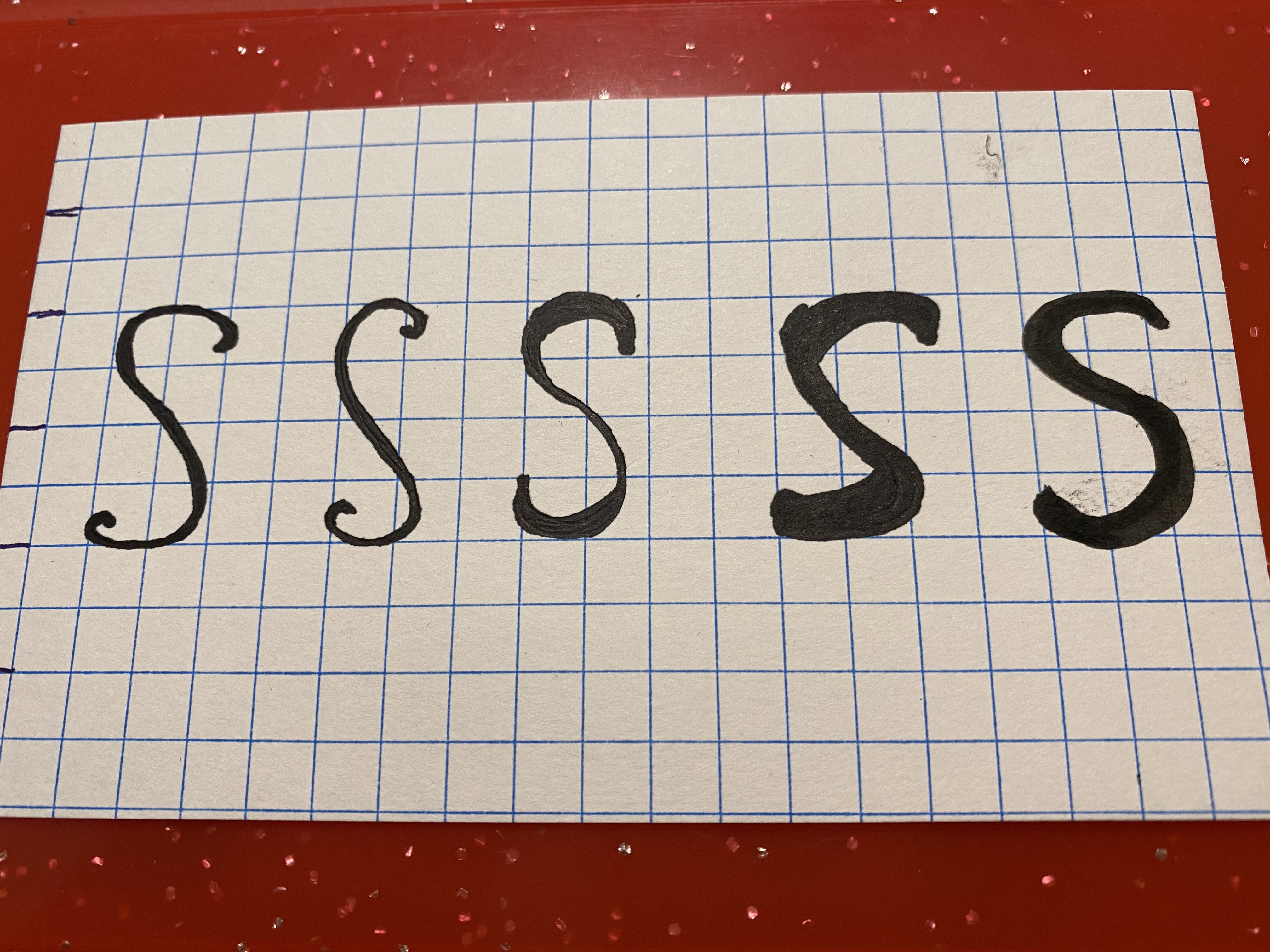

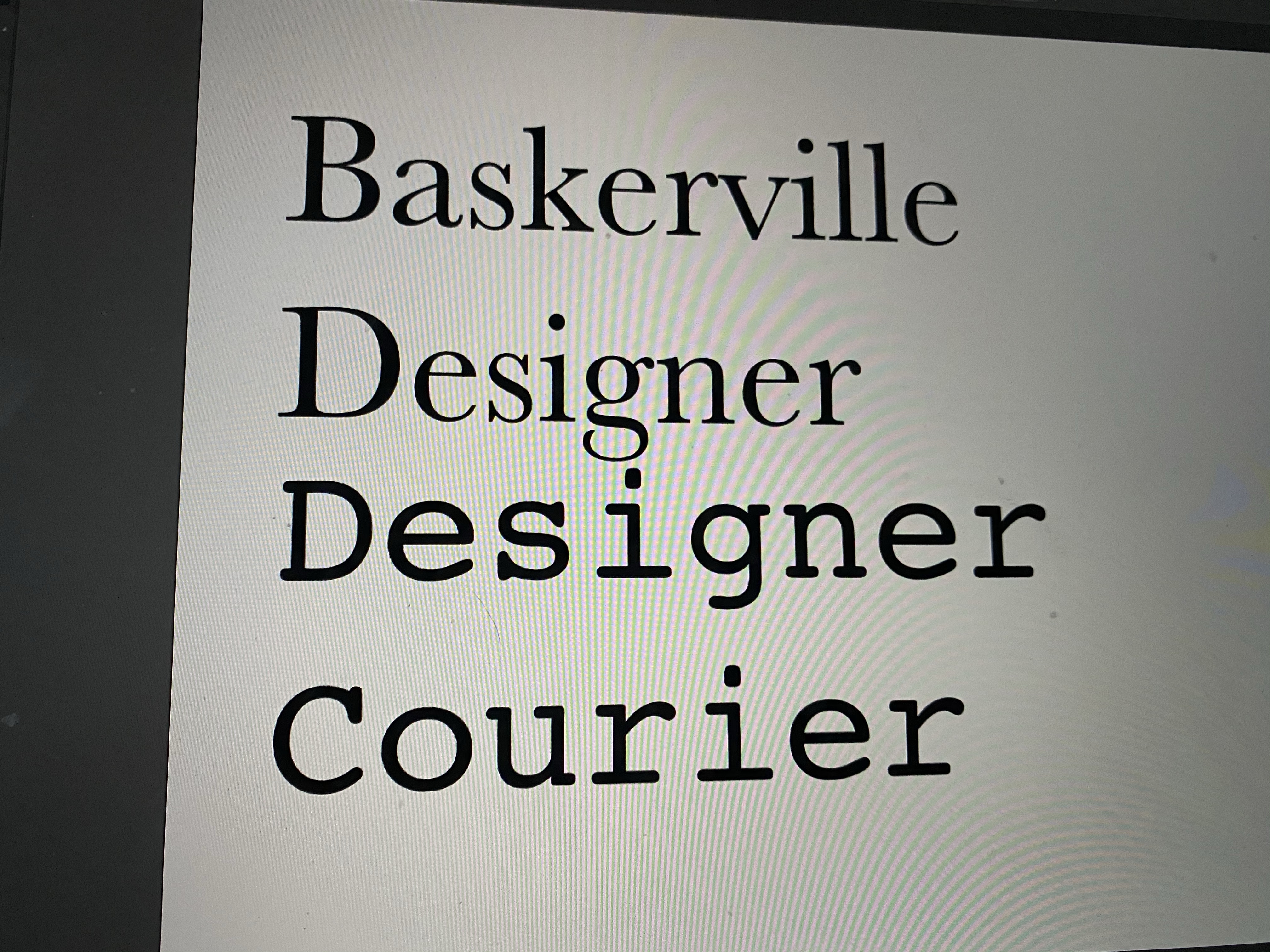
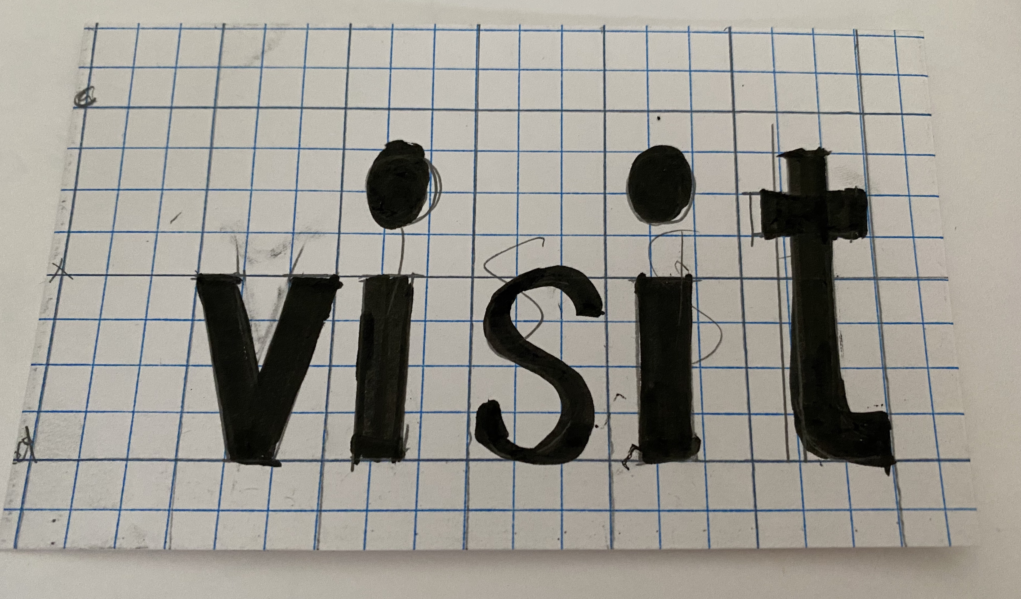
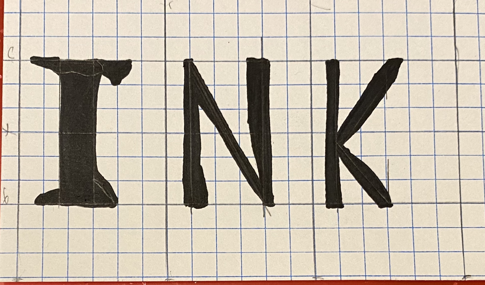
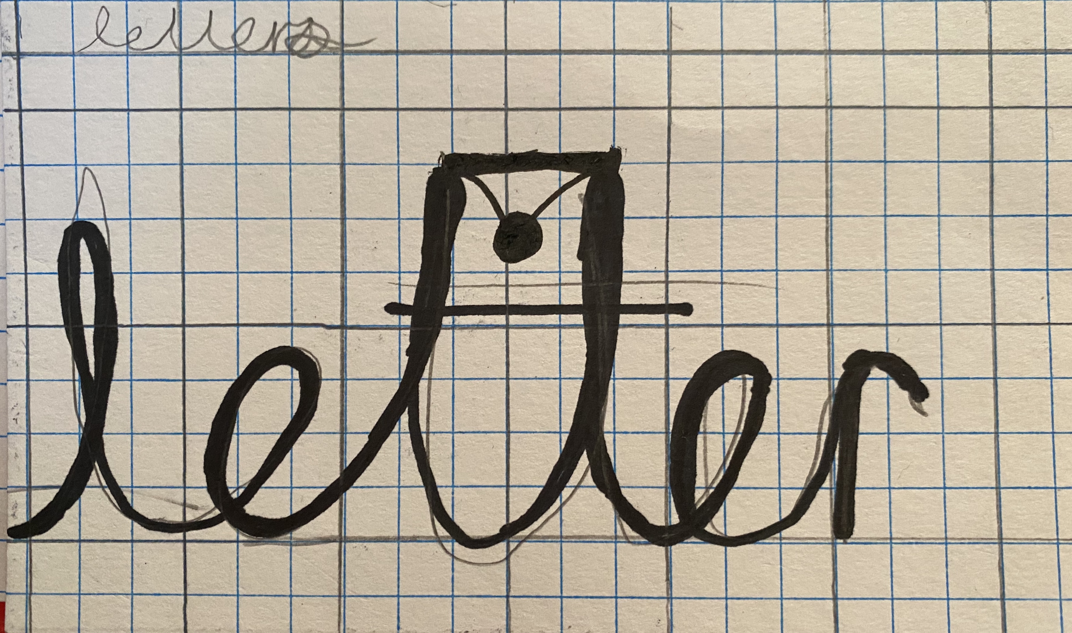
I merged Baskerville and Courier. Baskerville uses curves to lean into its serifs while Courier is consistent line weight and straight lines but rounded serifs. Baskerville also has a strong line weight variance and small spacing between the letters, while Couriers is a set distance.