All communication has rules. Writing has rules as down to its bare bones. The bare bones being the size, weight, color, contrast, case, and position. These bare bones allow for a better communication for a piece of writing as like this page we know the title is the title because it is a larger size and is a thicker weighted font compared to this text. Writing’s bare bones are all about typography which when done effectively has a strong sense of hierarchy. This hierarchy is seen in different forms such as in a book where there is the title, subtitles, paragraph text, and captions. Title being the largest in size and possible having the heaviest weight while the caption being the smallest in size.
Interactive Work Response/Review
An interesting piece of interactive art that I found is called 10,000 Moving Cities Same but Different by Marc Lee. This is an augmented piece that shows real time(well about as real time as you can get without going to place cameras/get access to cameras and audio all around these places) cities projected onto basic cube and rectangular prism pieces set in a room. Audio based on the city being shown is also played.

This is interactive as the people who view it get to choose which city they see. Simple in idea/concept but it seems to rely heavily on coding and technological skill. When people choose a city information is looked up and taken to create the atmosphere shift in the room; the text, audio, and visuals come from searching the web about the city chosen.
I find this intriguing but I am curious why the Marc Lee chose to add the boxes in the room. I don’t feel they add anything but dissonance to the work. If that dissonance was the point then it does the job it creates an odd look to an otherwise real showcase of a real-life city.
Curiously I found a site about future architecture and this was on it. Does this mean that the cube-like structures added to it are thought of as future architecture? Is it simply because it shows cities and cities are thought of as the future? Regardless the way this one described the work through me off as it described to process of loading images audio and text as coming from social media which makes this work have a different meaning. It goes from an exploratory way of engaging in virtual reality to a statement about the way we as a society use the internet. If looked at with both those things in mind it’s almost like we are comparing the different ways people approach technology and the availability to communicate with so many different people from far away. Look at the locations that you choose from.
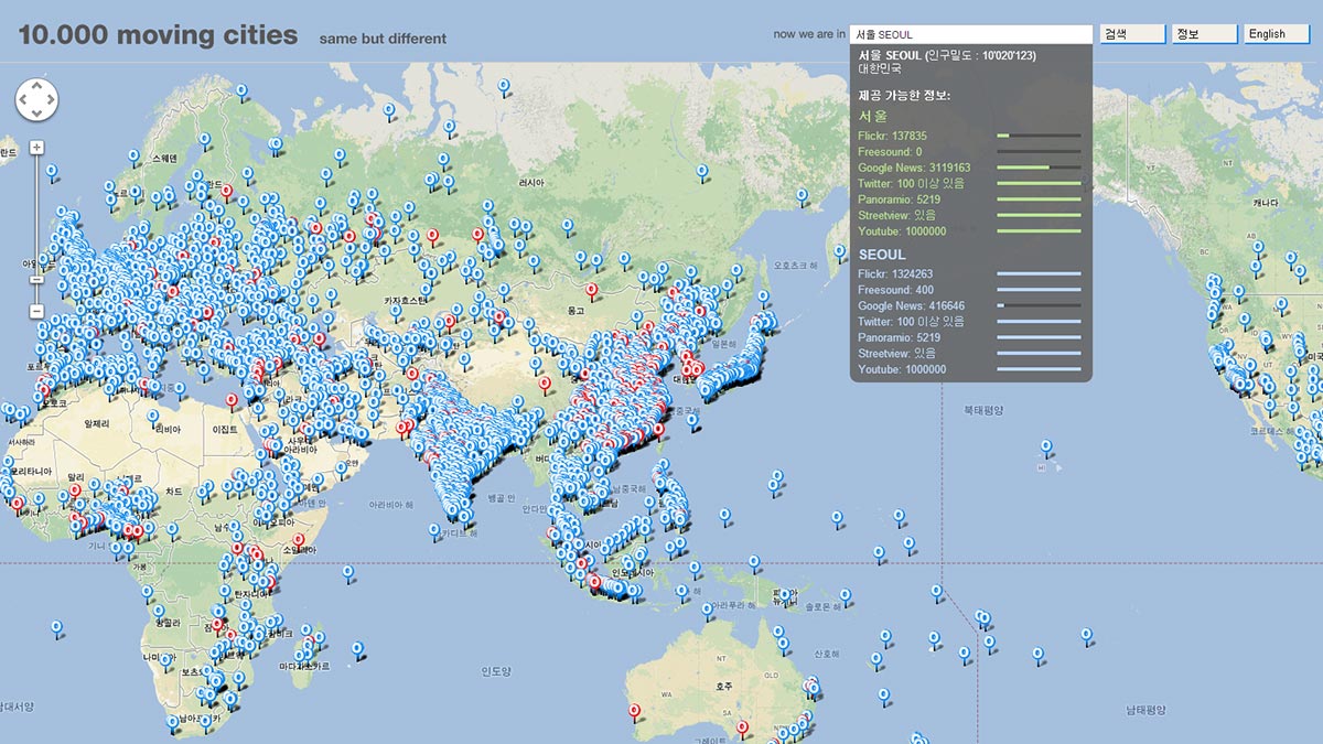
There is obviously more as part of the world gets cut off but look at all the locations we are able to choose from. Its feels nearly infinite. With all the choices there are bound to be interesting differences that can be explored. Simply put the way people post and what they post differs from person to person and from place to place. For example, as a non native to New York I posted photos of me and the people I traveled with in front of any building I could and I posted photos taken while on a ferry. In my hometown/city I post the art I create, the photos I take of family and the responses to things I look into but I rarely post myself. People and location change the way social media is used and because of that we can see some of the differences that we otherwise couldn’t.
Images and references from: http://marclee.io/en/10-000-moving-cities-same-but-different/ http://futurearchitectureplatform.org/projects/4a6a2c9d-e0bc-46e2-b0a5-c2fd3a2bee88/
Level Design Lessons Response
So many articles and essays about game design start with Super Mario Bros level 1-1 and this was no exception. Mostly these point out the way the character is used to control the way the game plays out and how players can shape the game. Other games included in the discussion are Castlevania and the Monuments of Mars. Interestingly there seems to be some common understanding about not having S shaped levels which is shocking. The shocking part is that it is agreed upon seemingly unanimously. I am more curious to figure out if there are other designers who make the s designed levels and if it common among indie games.
The screen shot below is of me playing Monster Sanctuary which is available on steam.

p5.js project Bloom
https://homepages.utoledo.edu/apotts3/bloom/
Cherry blossoms are only in bloom for a short period of time which is the bases for this project. Originally each interaction would make things drastically different but I changed the way the trees appear and the less noisy background elements.
My 2D Game Come Alive
Come Alive is a 2D game created in Unity about mannequins coming alive inside a factory. The point of the game is to collect the partial mannequins and to take them to the trash in order to clean up the factory. The game ends by collecting enough of the mannequins.

p5.js project critique notes
I created a p5.js project that involved circles growing and shrinking and I called it Growth. Main critique was simply about making the message understood as I initially wanted it to be in a delving between worlds vibe but it came across more as growth. Some things I will change are the colors as they gave off a different feel than I intended. I also will change the positioning of the circles so that they all remained on the canvas.
Art of Game Design Ch.8+9 Response
Brainstorming is necessary with all creative work. One way to make brainstorming work well is by listening to your subconscious and allowing it to voice its ideas and concepts. Allowing those ideas to come to flurision isn’t the goal the goal is to get creative thoughts going. The main thing is to take those weird and possibly off topic ideas and think about how they could work. This may create something majestic or it may create something to be thrown out, either way it allowed for the subconscious to be part of the creative process.
On top of using one’s sub-self there are some helpful tips on how to brainstorm effectively. Some are commonly used like to listen to yourself and record your ideas. Some are a little more out of the box as instincts don’t tell us this is the way to do the thing we want. So for instance in order to let oneself brainstorm with their subconscious one needs to maintain a decent amount of sleep and to maintain the needs of said subconscious. The needs of the subconscious is where things might get a little weird.
Don’t let your ideas or work be fragile. If it doesn’t work throw it out (or out of that project) and start over. There is a production cycle to follow when designing things. The cycle starts with and idea and moves on to building and testing the prototype(s) which is analyzed for problems and brought back to the designing stage for fixing and the cycle continues until the game is deemed finished. This cycle allows for the ideas to be played out and for there to be tests on how the ideas work or if they work. If the ideas are good and they come across then there is also the bug fixing, that is fixing small or sometimes large problems with the game such as missing textures or falling/clipping through objects.
Towards Minimalist Game Design Response
Minimalist game design is a quicker way to delve deep into the lore/story and choices in a game. The concept of minimalism also allows for more abstract worlds. These worlds don’t need to be photorealistic which allows an artist to play with their own visual style and literacy. Minimalist games are not simple in their story or space they are simple in the layout and amount of things/details of things seen in the game. Minimalist games allow for more variety in play for the player, as there are fewer rules and less things to get distracted by. The practically nonexistent distractions are thanks to the simple controls, and low viewed intricacy of the games visuals. Music and other sound effects are used in minimalist games mostly to encourage the feel the designer wants for the game. In some the sounds are to make the world seem larger and in some its used to make the player feel amped up to fight, run, race, etc;. Regardless of the term minimalist, games are still detailed in their story and play.
Hello World! Processing. Response
Processing is a way for people to work together to create codes that are creative. Your code becomes a sketchbook. Sketchbooks in this case can also become something more fleshed out and are simply lines of code that create imagery. Birds flying together in the video made me want to try to remake the same motion. That ted talk about contemporary math was an interesting touch. Basically everything in the world is a process that has a code. Even ocean waves have a code/process.
Although this video was a bit slow, I did find it interesting. There was also the point where they admitted that lines of codes didn’t look human, which is why people have there own way to format their lines. Processing is different than science because it is trying to create something that’s clearly outside of reality. Science is meant to recreate things from reality. Overall, I found that vimeo needs a playback speed option as some videos need to go at at least 1.5x speed.
JavaScript City

I created a surealist cityscape with JavaScript (p5.js). This is on the site called p5.js.org so feel free to make your own stuff.
If you want to see how I did this its below.
function setup() {
createCanvas(800, 600);
background(100,200,20);
}
function draw() {
strokeWeight(0);
stroke(200,400,20);
rect(0,400,100,200);
rect(90,350,75,250);
rect(150,380,100,220);
rect(350,300,90,350);
triangle(700,0,850,0,750,60);
strokeWeight(0);
beginShape();
vertex(40,30);
vertex(300,60);
vertex(100,90);
vertex(75,300);
endShape(CLOSE);
stroke(320,550,40);
strokeWeight(0);
fill(20,20,50,30);
rect(400,250,300,500);
rect(550,280,400,400);
stroke(250,200,60);
strokeWeight(0);
rect(200,300,200,300);
strokeWeight(0);
line(400,200,200,300);
background(100,200,20,50);
}

